Introduction
This interactive data visualisation allows you to compare different measures of inequality on a global level based on data from the World Inequality Database (WID). Use this interactive tool to explore how the distribution between countries has changed over time (1995-2020).
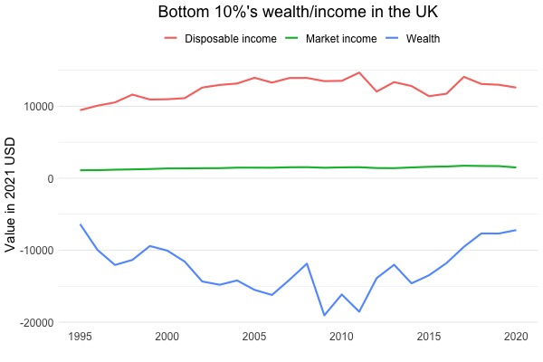
We measure inequality in three different ways: market income, disposable income and wealth.
- Market income refers to the annual earnings of individuals before taking into account government transfers such as benefits and taxes.
- In contrast, disposable income accounts for the effects of government transfers.
- Wealth represents the total value of the assets held by a household such as its savings, bonds and houses, minus its debts.
The chart below demonstrates how these measures differ. The disposable income (in 2021 USD) received by the bottom 10% of the UK population is positive and higher than their market income, because they receive government transfers/benefits. In contrast, their wealth is negative, indicating that they are in debt.
To learn more about how income and wealth measures differ, read Section 10.1 of The Economy.
Find out more
In this visualisation tool, we use data from WID. To learn more about how WID collects data, check this report. If you are interested in investigating what is included in market income and wealth, search this variable table on WID's website for the variables aptinc and ahweal respectively.
You can learn more about the differences between disposable and market income by reading Blanchet, Chancel and Gethin (2009) who also discuss some interesting trends in income inequality based on the WID.
Getting started
In this visualization, you can explore how the income and wealth distributions between countries has changed over time, using different measures. You can use the slider to select a particular year.
- The 'Market income vs. wealth' tab allows you to compare how the global distributions of wealth and market income have evolved between 1995 and 2020.
- In the 'Changes in inequality' tab, you can see how market income inequality and wealth inequality have changed since 1995 in each country, for which we have data.
- The 'Disposable income in Europe' tab allows you to compare how the disposable income distribution in Europe has changed since 1995.
- Using the 'Disposable income inequality measures', you can examine disposable income inequality in various European countries and the US according to different measures of inequality.
The interactive graph utilises 2022 data from the World Inequality Database (WID). While WID is an extremely rich database, it only contains disposable income data only for Europe. Our graph is based on Figure 1.2 of The Economy.
To learn more about how income and wealth inequality have evolved over time, read Unit 1 of The Economy.
Global market income/wealth distribution
In this tab, we compare the global distribution of wealth and market income in the selected year. The 3D plot shows the average annual income or wealth in each decile for all observed countries (measured in 2021 USD). Our income and wealth measures take into account changes in purchasing power over time. For more details, see Section 1.2 of The Economy.
For each country, the tallest bars show the average income of the richest 10%, and the shortest bars show the average income of the poorest 10%. Countries are ordered from left to right by average income in the selected year but are coloured according to their PPP-adjusted national income per capita in 1995 (dark red = poorest, dark green = richest). The width of each bar reflects the population in that country.
You can explore how the market income and wealth distributions have evolved by selecting any year between 1995 and 2020.
- To explore in more detail the market income distribution (1980-2020), visit CORE Skyscraper 1: Exploring global income inequality.
- To explore in more detail the global wealth distribution (1995-2020), visit CORE Skyscraper 2: Exploring global wealth inequality.
You can also download the WID data that we use for these diagrams from the links above.
The global market income distribution in the selected year is shown in the chart below.
The global wealth distribution in the selected year is shown in the chart below.
- There might be negative wealth owed by the lowest deciles in certain countries, which indicate that on average people in these deciles are in debt.
- Note that the wealth and income axes (the heights) in the two graphs have very different scales.
Comparison of market income and wealth inequality
We can also measure the extent of inequality by market income and wealth. To that aim, consider one measure of inequality: the rich/middle income ratio. It divides the income owned by the richest decile of the population by the income owned by the middle decile (see the 'Disposable income inequality measures' tab for further details).
In the selected year, the average rich/middle market income ratio across all countries is whereas the average rich/middle wealth ratio is .
Changes in inequality relative to 1995
In this tab, we compare how market income and wealth inequality have changed in various countries across the world since 1995. We begin by ranking countries according to their level of inequality in 1995. The more equal a country, the lower its rank, so that the most equal country is ranked first.
In each subsequent year, we again rank countries by their level of (market or wealth) inequality. Next, we subtract the rank in the selected year from the rank in 1995, e.g., for the year 2005 we would calculate the rank(1995) - rank(2005). If the difference is a positive number, the country has become more equal relative to other countries. But if the difference is negative, the country has become relatively more unequal. We refer to this difference as a change in rank: positive values indicate a relative decrease in inequality and negative values show an increase in inequality.
The change in market income ranking in the selected year relative to 1995 is shown below. Countries are coloured according to their 1995 PPP-adjusted national income per capita. (Note: this graph will be empty if the selected year is 1995 because we calculate changes in rank relative to 1995, so in 1995 all changes in rank are zero by definition.)
The change in wealth ranking in the selected year relative to 1995 is shown below.
Some countries, such as India and China, are coloured differently in the two charts. This is due to the fact that we have wealth data for fewer poor countries compared to market income data. As a result, China and India are richer relative to the observed countries in the wealth data than relative to the observed countries in the market income data.
Disposable income distribution in Europe
In this part, we compare the global distribution of disposable income in the period 1995-2020. Like the 3D plots in the 'Pretax income vs wealth' tab, this plot shows the disposable average annual income in each decile for all countries with available data (measured in 2021 USD). Our income measure takes into account changes in purchasing power over time. For more details, see Section 1.2 of The Economy. You can also access the WID data that we have used to create the plot in Excel (.xlsx) format by clicking here.
The width of each bar reflects the population in the respective country. We have also added labels for the ten largest European countries in terms of population. Countries are ordered from left to right by average income in the selected year but are coloured according to their PPP-adjusted national income per capita in 1995 (dark red = poorest, dark green = richest).
Different inequality measures in Europe and the US
In this section, we compare three measures of disposable income inequality in Europe and US and how their values have changed since 1995.
1. Gini coefficient - a measure of inequality of any quantity such as income or wealth, varying from a value of zero (if there is no inequality) to one (if a single individual receives all of it). Higher values of the Gini coefficient indicate greater inequality. The Gini coefficient is calculated as one-half times the average of the income differences between people in the population, divided by the average income of the population. For more information, read Unit 5 of The Economy.
2. Rich/poor income ratio - the income of the richest 10% in the population (10th decile) divided by the average income of the bottom 10% in the population (1st decile). The higher the ratio is, the more unequal the distribution of income will be.
3. Rich/middle income ratio - the average income of the richest 10% in the population (10th decile) divided by the average income of the middle 10% in the population (5th decile). The higher the ratio is, the more unequal the distribution of income will be. The definition is analogous to the Rich/poor income ratio, except that the denominator is the income of the middle 10% rather than the poorest 10%.