Introduction
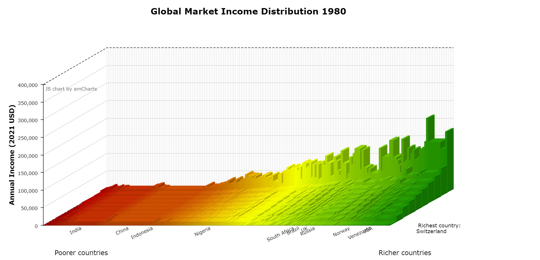
The global distribution of income has changed dramatically since 1980. The figure below shows the world income distribution in 1980, where countries are ordered from poorest in red on the left to richest in green on the right. The height of each bar shows the average income in each decile within a country, ordered from the poorest 10% (at the front) to the richest 10% (at the back). The figure uses data from the World Inequality Database (WID).
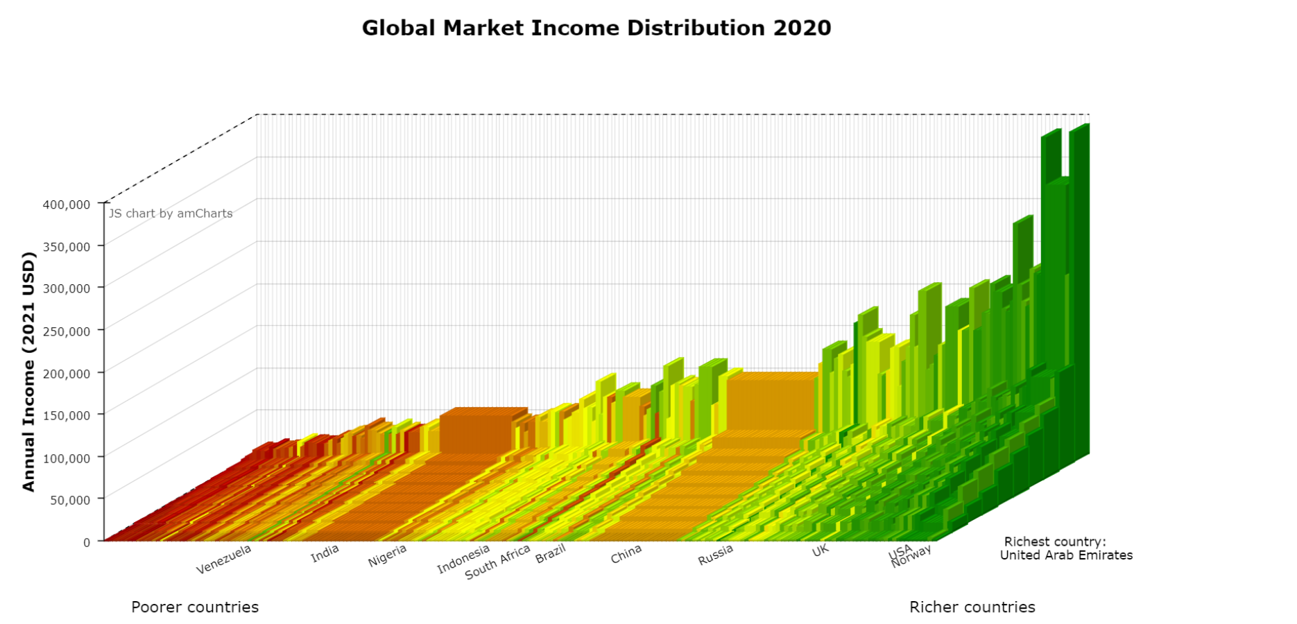
By 2020, which is the latest available data, many countries have changed their ranking, and the heights of the bars also become more unequal, with some very tall skyscrapers appearing.
Note that these diagrams report market income which refers to the annual earnings of individuals before taking into account government transfers such as benefits and taxes. Use this interactive tool to explore how the market income distribution within and between countries has changed over time (1980-2020). For up to seven countries of your choice, you can create a ‘skyscraper’ diagram, view the Lorenz curves and Gini coefficients, and compare the rich/poor ratio or the rich/middle ratio of market incomes within each country. For the skyscraper figure in context, see Figure 1.2 of The Economy, and Figure 1.1 of Economy, Society, and Public Policy.
Find out more
To explore in more depth the skyscraper diagrams of the global market income distribution, visit CORE Skyscraper 1: Exploring global income inequality for an interactive version of the graphs. From that website, you can also download the WID data that we used to construct the figures. You can learn more about how WID collects data by checking this report. If you are interested in investigating what is included in market income, search for variable aptinc in this variable table on WID's website.
To find out more about the trends in income and income inequality over the past few centuries, how to measure inequality, and policies that can address economic inequality visit our Economic Inequality pathway on the online learning platform LabXchange.
LabXchange is Harvard’s online community for educators, learners, and researchers to collaborate on educational content. CORE has partnered with LabXchange to be the first provider of economics content.
A pathway is a learning experience assembled like a storyline, consisting of different elements – for example, text with slideline figures and questions with immediate feedback. We suggest the order in which these elements should be presented to students, however, teachers have the flexibility to select some, and incorporate them to other material they are already using on LabXchange.
Getting started
In this visualization, you can explore how the market income distribution within and between countries has changed over time.
You can use the slider to select a particular year, and the drop-down menu to select up to seven countries (you can also type in the country names to search for specific countries). To remove a country from the list, select it and press Delete or Backspace on your keyboard.
- The 'Skyscraper plot' tab shows the market income distribution for your chosen countries as a 3D plot, where the heights of the bars show the average market income in each decile.
- In the 'Lorenz curve' tab, you can see how much the market income distribution for each country differs from a perfectly equal market income distribution, and the associated Gini coefficient.
- The 'Rich/poor income ratio' tab allows you to compare countries according to another measure of inequality: how many times richer the richest people in a country are compared to the poorest.
- The 'Rich/middle income ratio' tab allows you to compare countries according to one more measure of inequality: how many times richer the richest people in a country are compared to people who earn an average market income.
This visualization is based on Figure 1.2 of The Economy and uses 2022 data from the World Inequality Database.
To learn more about how income and wealth inequality have evolved over time, read Unit 1 of The Economy.
Choose up to 7 countries
The 3D plot shows the average market income in each decile for your chosen countries (annual income in thousands of 2021 USD). This measure of market income takes into account changes in purchasing power over time. For more details, see Section 1.2 of The Economy. To explore in more depth the global market income distribution for all countries, visit CORE Skyscraper 1: Exploring global income inequality.
For each country, the tallest bars show the average market income of the richest 10%, and the shortest bars show the average market income of the poorest 10%. Countries are ordered from left to right by average national income (in thousands of 2021 USD) in the year chosen and are coloured according to their average income in that year.
You can click and drag the plot to read the axes values more clearly, and zoom in and out using the scroll function on your mouse or trackpad.
You should note two things about the visualisations:
- The colouring of a country's bars changes according to the country's relative position in the national income per capita ranking. For instance, you can experiment with China which moves from the lowest quintile (dark red) to the second quintile (light green).
- In the global skyscraper figures, the size of the country’s population is reflected in the width of its block. To enable up to seven countries to be compared, in this visualization, each country’s block is the same width.
Key concepts
Gini coefficient - a measure of inequality of any quantity such as market income or wealth, varying from a value of zero (if there is no inequality) to one (if a single individual receives all of it). Higher values of the Gini coefficient indicate greater inequality. The Gini coefficient is calculated as one-half times the average of the market income differences between people in the population, divided by the average market income of the population. It can be approximated by dividing the area enclosed by the Lorenz curve and the perfect equality line by the entire area under the perfect equality line (shown in red). For more information, read Unit 5 of The Economy.
Lorenz curve - a graphical representation of inequality of some quantity such as wealth or market income. Individuals are arranged in ascending order by how much of this quantity they have, and the cumulative share of the total is then plotted against the cumulative share of the population. For complete equality of market income, for example, it would be a straight line with a slope of one. The extent to which the curve falls below this perfect equality line is a measure of inequality.
Key concept
Rich/poor income ratio - the market income of the richest 10% in the population (10th decile) divided by the average market income of the bottom 10% in the population (1st decile). The higher the ratio is, the more unequal the distribution of market income will be.
Note: Countries are coloured according to their average income in the year you have selected. Thus, if a country's income is growing, its colour can change from shades of red to shades of green.
Key concept
Rich/middle income ratio - the average market income of the richest 10% in the population (10th decile) divided by the average market income of the middle 10% in the population (5th decile). The higher the ratio is, the more unequal the distribution of market income will be. The definition is analogical to the Rich/poor income ratio, except that the denominator is the market income of the middle 10% rather than the poorest 10%.
Note: Countries are coloured according to their average income in the year you have selected. Thus, if a country's income is growing, its colour can change from shades of red to shades of green.